Functions
Lighting is an important component of the aforementioned mise-en-scène. Film lighting creates both illumination and shadow. The interplay between light and shadow expresses the mood of a scene, defines a character, and shapes the cinematic space on screen.
Racial justice should be part of lighting strategies. Lighter skin tones tend to reflect more light, while darker colors tend to absorb it. Different skin tones also create different levels of shading. Poor lighting choices in some films have made characters and actors appear, quite literally, in a different light than who they are, or flatter only certain characters. The color of costumes also affects how the scene is lighted effectively. It takes more deliberate effort to provide lighting for several characters in the same scene who have different skin tones.
More discussion of this topic can be found in the next section on “Examples.”
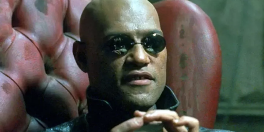
Sexism has also informed lighting strategies for many films. Male characters are often lit to reveal depth, details and their three-dimensional features. In the image below, hard light from the side and the top accentuate the authoritative status of Morpheus (Laurence Fishburne), captain of the hovercraft Nebuchadnezzarin in The Matrix (dir. Lana and Lilly Wachowski, 1999).
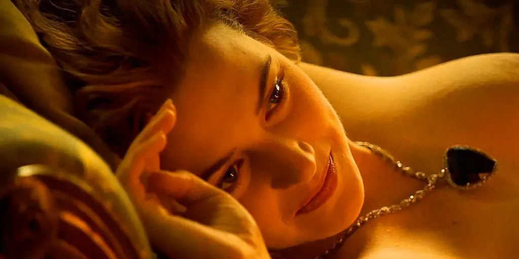
In contrast, female characters are more frequently lit as two-dimensional (2D) with multiple sources of light from several angles, making them look more smooth but lacking depth. In this light, female characters are not seen as part of their surroundings in the same way as those with more shadows and details. Female characters are thus de-humanized and are positioned for aesthetic pleasure of viewers.
The following scene in James Cameron’s Titanic (1997), warm, soft, 2D lighting flatters and eroticizes Rose (Kate Winslet) who sits for a drawing. Her love interest Jack Dawson (Leonardo DiCaprio) sketches her portrait from life. Here is a clip of the scene.
Just as lighting is a key element in the presentation of gender roles, slow pan or tilt (see the lesson on Camera Movement), fragmentary framing, and Point-of-View (POV) shots also disconnect characters from their environment.
Learn more about film techniques and social justice issues in the lesson units mentioned above: Shots, Camera Movement, Framing, and Social Justice.
Textures of characters’ costumes and their surroundings can be concealed or highlighted by lighting, and expressive lighting strategies manipulate audience perception of a scene. Even when lighting appears “natural,” it has been carefully planned and executed.
Here are some basic techniques.
Hard, or direct, light gives a crisp definition of the subjects with dark shadows behind them. Hard light is often used in horrific or threatening situations, making a character seem overbearing.
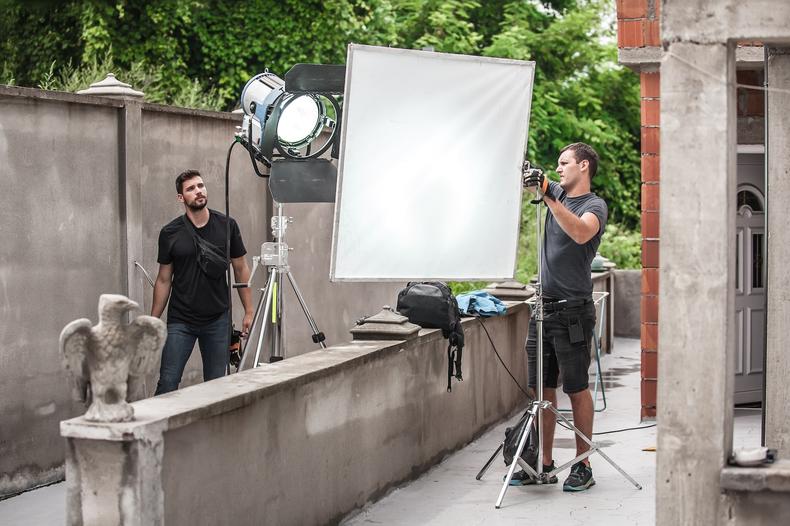
Soft, or diffused and less defined, light, is often more flattering, because—by virtue of its low contrast—it blurs the boundary between illumination and shadow. Soft light is created by passing the source of light through a semi-translucent screen or by bouncing light off a surface. Soft light is often used in romantic scenes.
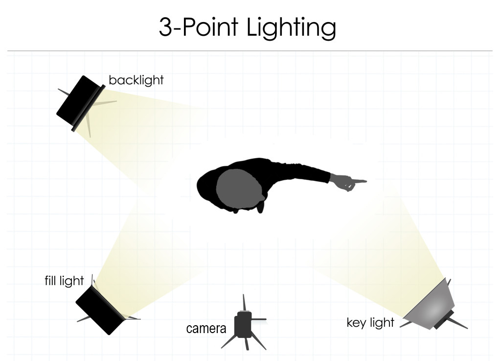
Three-point lighting combines bright, key light in the front for definition, fill light to soften the shadows, and backlight behind the subject for balance. Here is an illustration showing a typical setup for three-point lighting.
In general, lighting a character or an object from a forty-five degree angle is more effective in revealing their contours without distortion.
Source: Intellicraft
The ratio of light and shadow matters, and here are two key concepts related to ratio.
Some scenes call for harsh, gloomy low-key lighting. There is no fill light as noted above. There is a high contrast between areas that are brightly lit and areas that are in the dark. This technique is used in film noirs, horror films, and mysterious crime scenes.
Other scenes, often those in comedies, require high-key lighting with little contrast between bright and shadowy parts of someone’s face or an object. The entire scene is evenly illuminated. Lighting does not call attention to itself or any particular character or object.
The direction of light in relation to the camera and the subject can change the mood. A subject who is backlit will appear in silhouette. The character can be frightening or heroic.
When a subject is lit from above in top lighting, they can appear more glamorous. If the light is too strong, however, the subject can appear more threatening because their eyes would be in the shadow.
The following short video demonstrates five key lighting strategies at work, including the aforementioned three-point lighting, high versus low key lighting (ratios), soft versus hard lighting (quality of light), varying color temperature, and naturalistic versus expressionist lighting.
The very same architectural space could be presented as inviting or foreboding depending on the quality, ratio, and direction of cinematic lighting, as discussed in the next section on “Examples.”
Source: Pexels
Examples
Lighting actors with darker skin tones has been a challenge, because major Hollywood studios traditionally devoted more resources to the perfection of lighting strategies to flatter lighter skin tones. Misuse of hard light had caused actors to sweat, and inappropriately distributed light prompted some actors to put vaseline on their skin in order to reflect enough light.
A game changer is Woman King, Gina Prince-Bythewood’s 2022 historical action drama film. In a scene in the court, King Ghezo (John Boyega), his court, and General Nanisca (Viola Davis) are evenly and appropriately lit without overuse of hard light. The lighting team accomplished this despite the challenge of a back-lit set with a high dynamic range (high contrast between very bright and dark spots on the set).
The following scene is another example of intentioned and thoughtful lighting design that enables actors of color to be appreciated as fully dimensional even when their characters are in a dimly-lit interior space.
Three-point lighting represents foundational elements of film lighting. Here is a scene with three-point lighting in Amelie, directed by Jean-Pierre Jeunet (2001). In the close-up shot of Amelie, her face is lit by key light from the front to the right and by fill light from the front to the left. Further, her shoulder and head are lit from the back by backlight.
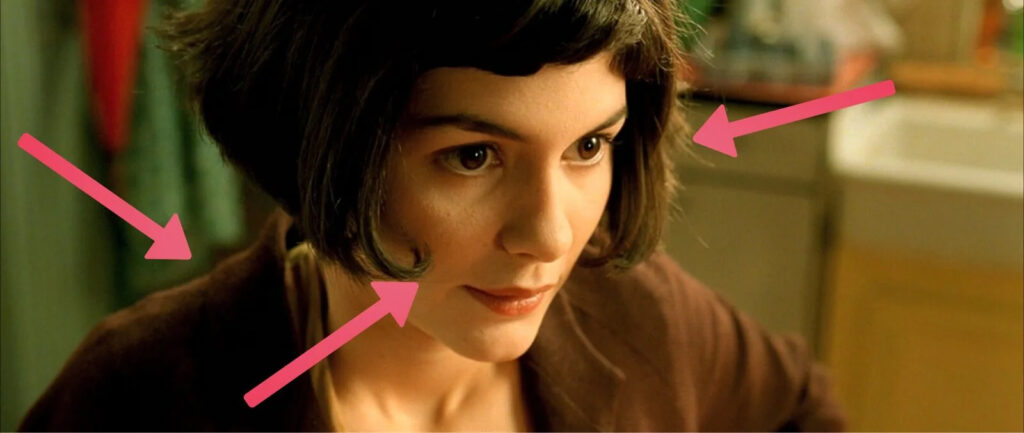
Lighting is also important for the set. Many films are shot in the same location. By comparing their quality and strategies of lighting, we can gain insight into how light and shadow change the mood and setting.
The Bradbury Building, an architectural landmark in downtown Los Angeles, for example, has been featured in many films and television shows. Built in 1893, the five-story building features an atrium with ornate ironwork.
Here are two contrasting films that use Bradbury Building in different ways, turning the same corner into a foreboding and an inviting spaces, respectively.
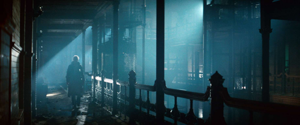
In this scene in Ripley Scott’s Blade Runner (1982), the low-key lighting makes the space look mysterious and foreboding.
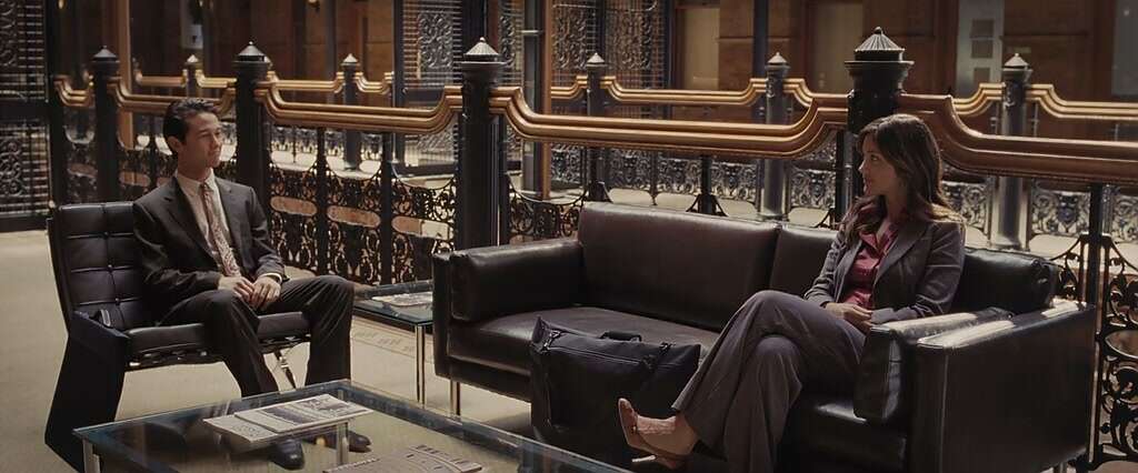
By contrast, the same space looks inviting in Five Hundred Days of Summer, directed by Marc Webb (2009).
Exercise
Your Turn: Compare and contrast the meanings of these two scenes in Julie Taymor’s The Tempest (2010).
The first film still is from the scene that depicts the “monstrous” character Caliban being confronted by the colonizing magician Prospera and her daughter Miranda.
The second film still is taken from a later scene that depicts the same character (Caliban) meeting Stephano and Trinculo, a drunken butler and a jester, who arrived on Caliban’s island after a shipwreck.
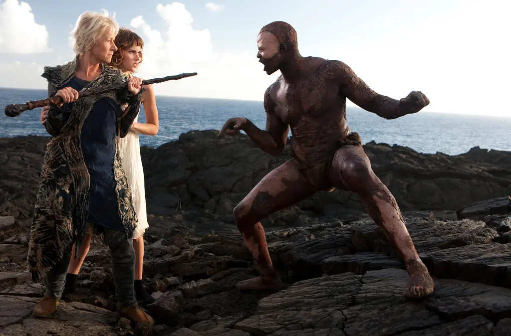
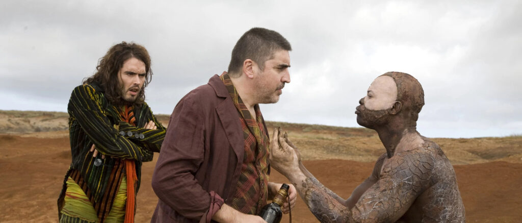
Answer Key provided and discussed in class.
Hint: These shots literally put Caliban in different light. They shed a new light on the character who has been derided as being savage by the colonizers. However, in Caliban’s view, it is the colonizers who are “uncivilized” in their subjugation of Caliban and his island.
